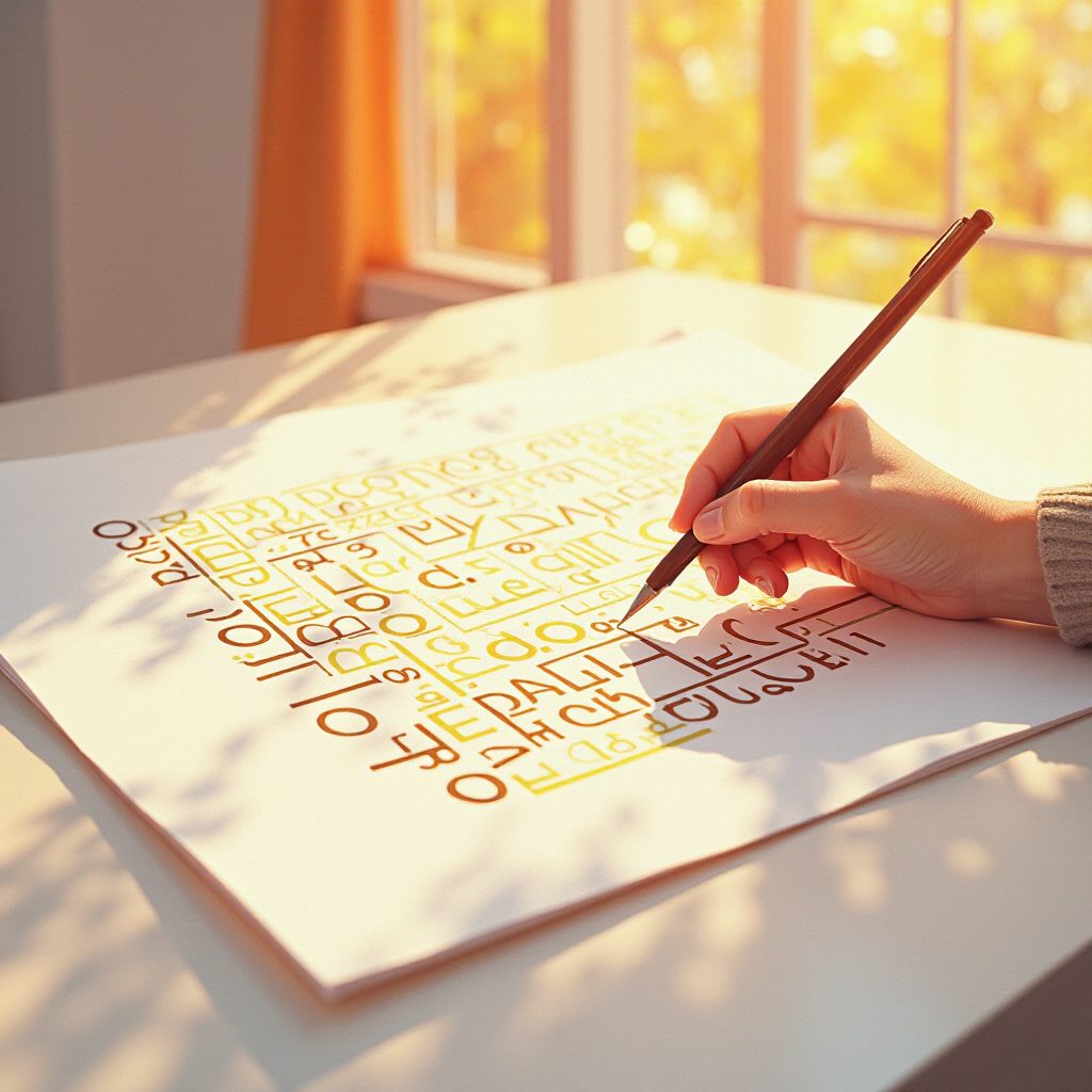
 İnsanların okuyabildiği ama yapay zekanın çözemediği yeni fontlarDesigners and Computer Scientists Create New Decoy Fonts That Humans Can Read but A.I. Bots CannotHabere gitRead the article Türkçe (otomatik çeviri) English (automatic translation) |
ÖzetSummaryTasarımcılar ve bilgisayar bilimcileri, yapay zekâya karşı yazı tipleri tanıttı. MixFont'un Decoy Font'u, insanın okuyabileceği mesajı yapay zekânın okuyabileceği bir mesajın arkasına yerleştiriyor. ShieldFont ise kaynak kodda içerik kelimelerinin yaklaşık %50'sini anlamsız karakterlerle değiştiriyor. Bu yazı tipleri, büyük dil modellerinin (LLM) ve kazıma botlarının insan yazdıklarını emmesini engellemeyi hedefliyor.Designers and computer scientists have introduced fonts designed to resist AI. MixFont's Decoy Font places a message readable by humans behind a message readable by AI. ShieldFont, on the other hand, replaces approximately 50% of content words in the source code with meaningless characters. These fonts aim to prevent large language models (LLMs) and scraping bots from ingesting human-written text. |
Neden ÖnemliWhy it mattersYapay zekâ ajanları giderek daha fazla arama motorlarını, mesajlaşma uygulamalarını ve yazı platformlarını tarıyor. Bu yazı tipleri, hukuki ya da teknik altyapıya dayanmadan metinsel gizliliği geri kazanmak için tabandan gelen, tasarım düzeyinde bir çaba. Çalışma aynı zamanda daha geniş bir kültürel tepkinin de sinyali. MixFont'un kurucusu bunu 'yapay zekâ yorgunluğu' olarak adlandırıyor. Yaratıcılar, sözlerinin eğitim verisine dahil edilmesinden düşük sürtünmeyle çıkış yapmanın bir yolunu istiyor. Bu çalışma, tipografik tasarımı pasif bir estetik tercih olmaktan çıkarıp aktif bir gizlilik aracına dönüştürüyor.AI agents are increasingly scanning search engines, messaging apps, and writing platforms. These fonts represent a grassroots, design-level effort to reclaim textual privacy without relying on legal or technical infrastructure. The work also signals a broader cultural backlash. MixFont's founder calls this 'AI fatigue.' Creators are seeking a way to opt out of their words being included in training data with low friction. This work transforms typographic design from a passive aesthetic choice into an active privacy tool. |
Öne ÇıkanlarHighlights
|
EleştiriCritical takeMakale, bağımsız bir değerlendirmeden çok kurucu alıntılarının tanıtım derlemesi gibi okunuyor (Forbes, Dezeen, Fast Company). Üçüncü taraf kıyaslaması yok. Bu yazı tiplerinin güncel OCR hatlarını gerçekten alt ettiğine dair bir kanıt da yok. Basit bir ekran görüntüsü alıp yeniden işlemenin bu yanılsamayı tamamen aşmayacağına dair bir gösterim de mevcut değil. Hibrit görüntüleme analojisi de zorlama. 2007'deki MIT portreleri insan derinlik algısını kullanıyordu; transformer'ların token'laştırma sürecindeki bir güvenlik açığını değil. Bu paralel daha çok retorik, teknik değil.The article reads more like a promotional compilation of founder quotes than an independent assessment (Forbes, Dezeen, Fast Company). There is no third-party comparison. There is also no evidence that these fonts truly defeat current OCR engines. There is no demonstration that simply taking a screenshot and reprocessing it would not completely bypass this illusion. The hybrid viewing analogy is also forced. The 2007 MIT portraits used human depth perception; they did not exploit a security flaw in the tokenization process of transformers. This parallel is more rhetorical than technical. |