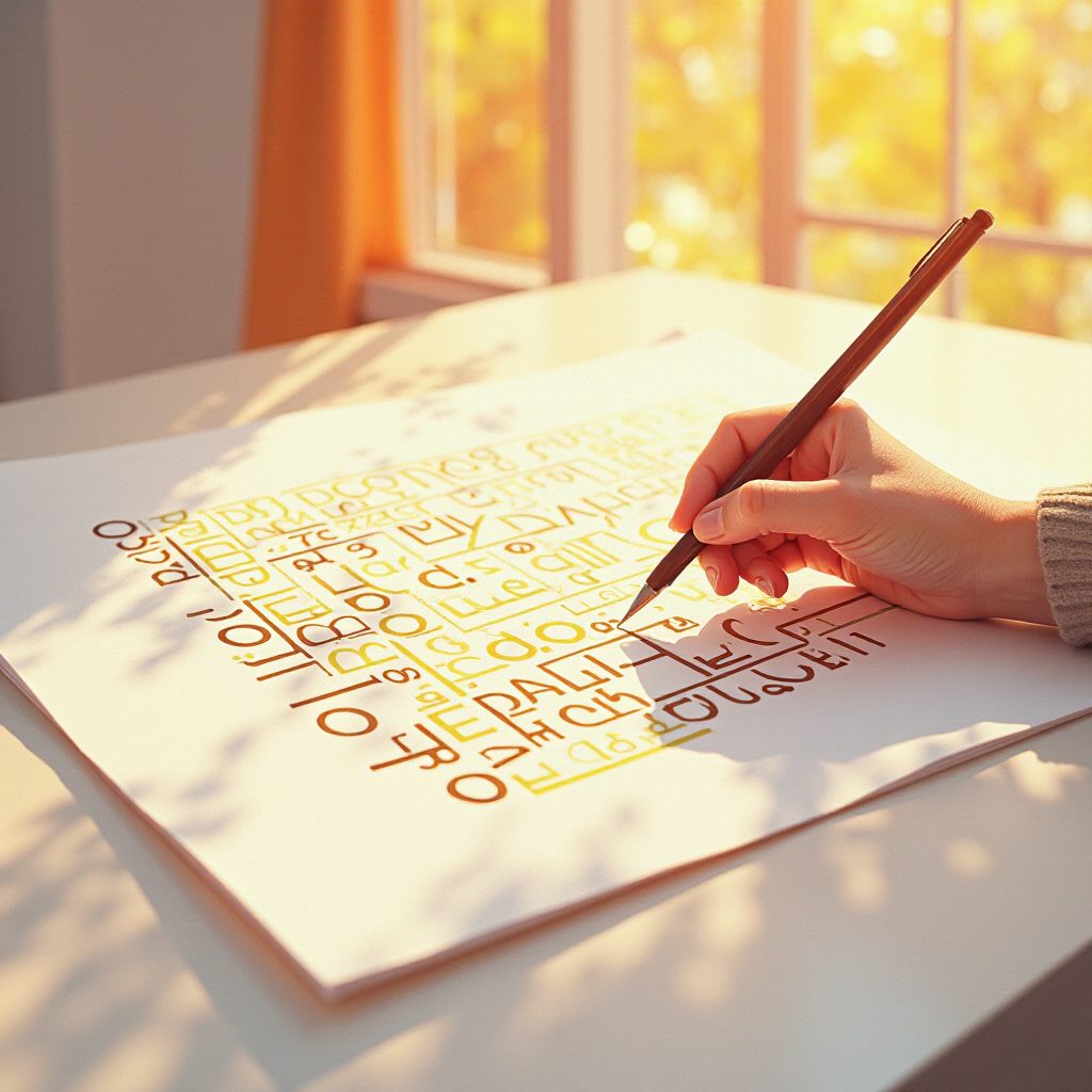
 Designers and Computer Scientists Create New Decoy Fonts That Humans Can Read but A.I. Bots CannotRead the article English (automatic translation) |
SummaryDesigners and computer scientists have introduced fonts designed to resist AI. MixFont's Decoy Font places a message readable by humans behind a message readable by AI. ShieldFont, on the other hand, replaces approximately 50% of content words in the source code with meaningless characters. These fonts aim to prevent large language models (LLMs) and scraping bots from ingesting human-written text. |
Why it mattersAI agents are increasingly scanning search engines, messaging apps, and writing platforms. These fonts represent a grassroots, design-level effort to reclaim textual privacy without relying on legal or technical infrastructure. The work also signals a broader cultural backlash. MixFont's founder calls this 'AI fatigue.' Creators are seeking a way to opt out of their words being included in training data with low friction. This work transforms typographic design from a passive aesthetic choice into an active privacy tool. |
Highlights
|
Critical takeThe article reads more like a promotional compilation of founder quotes than an independent assessment (Forbes, Dezeen, Fast Company). There is no third-party comparison. There is also no evidence that these fonts truly defeat current OCR engines. There is no demonstration that simply taking a screenshot and reprocessing it would not completely bypass this illusion. The hybrid viewing analogy is also forced. The 2007 MIT portraits used human depth perception; they did not exploit a security flaw in the tokenization process of transformers. This parallel is more rhetorical than technical. |